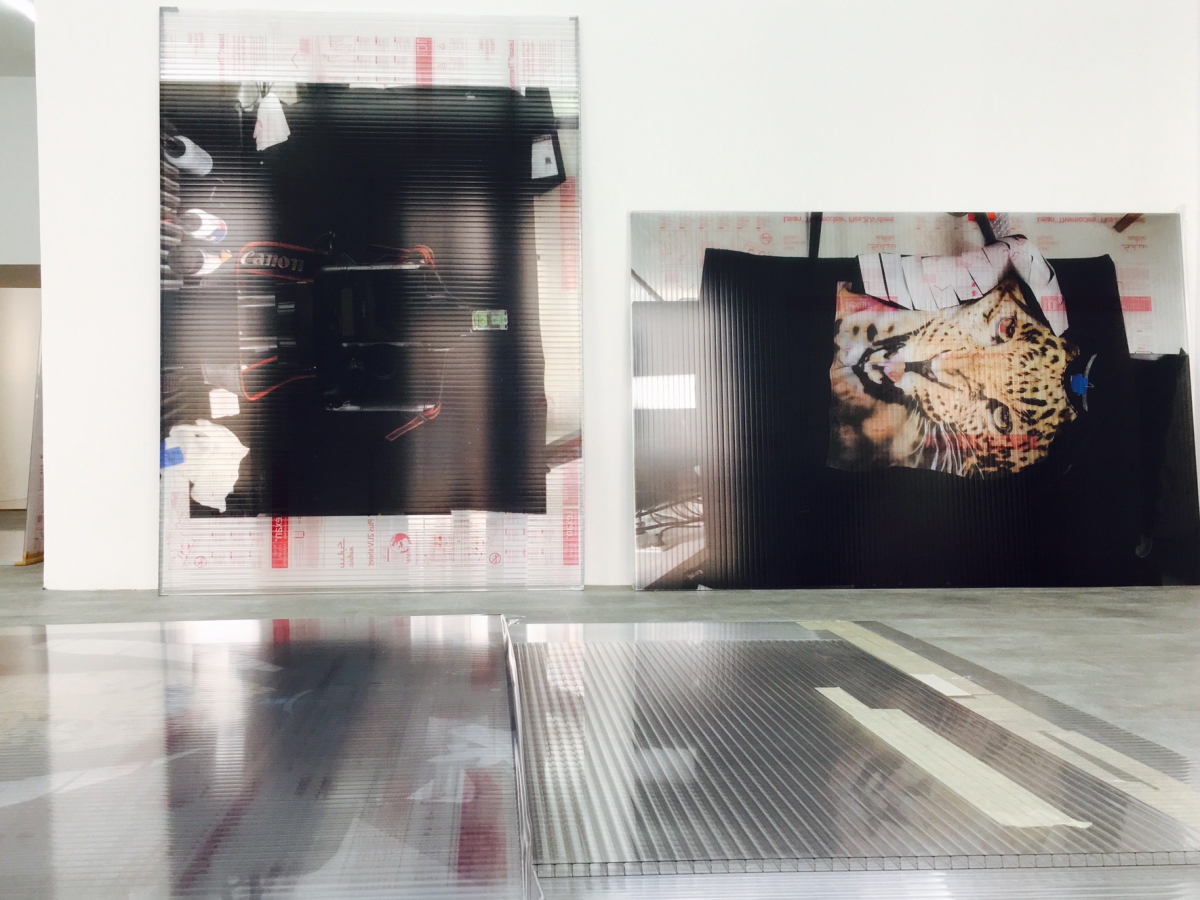
Christina Michalis: AVOID / NOBODY, Installation Galerie1214 (Berlin), print on foil and polyacrylic, mixed media, 2017
An enfilade with transparent, colored panels arranged in close formation, leaning diagonally against the walls, even scattered in several places on the floor; sometimes preventing free passage. Panels that are simultaneously images and image carriers, whose presentation brings a distinct sculptural air into the room: every so often transparent foil surges beyond the edges, at times like protective padding, at others like a lavish throw; shimmering and with a velvety quality.
Upon first glance the material may seem peculiar: twin-wall panels, many of which still display a printed multilingual protective foil on the back. The opposite side is covered with a printed adhesive foil. In some cases the printing is reduced to a subtle trace of color with barely noticeable contours, while other panels feature bold colors and highly pronounced forms. Occasionally there are still strips or leftover tape or protective paper edging.
Every step through the installation facilitates the conscious shift of the lighting perspectives. The room’s lighting from above and the daylight that enters from the side permeate each other. It is in the hands – or rather the eyes – of the viewer to orchestrate a perpetual interplay. The roaming vantage point transforms black into tracks, reflections disappear. Depending on the position and incidental light, gray seems to envelop the room with an almost bokeh-like effect. Colors shimmer, fade, change suddenly or emerge unexpectedly in a rainbow spectrum.
The figurative themes seem familiar but also confusing due to their ordinary character: consumer products, a popular camera brand, images of sweatshirts; the head of a cheetah, a single panel with oversized fruits. Practically pretentious is the extreme magnification of a fabric, an enlarged section of warp and woof. Here as well, the motif printing is just subtle enough to prevent representational realism from occurring. The interplay between hard panel material and supple carrier foil is more of an allusion from the image plane into the room, actually back to the viewer again, who has the urge to touch the material.
In one part of the room, an arrangement of three rectangular panels lying on the floor occupies the center of the space. The edges are offset against each other and the direction of the beams between the panel walls is turned by 90° for each. The placement of the panels makes it necessary to walk around them. The reflections of the tubular lighting on the ceiling thereby move correspondingly, reflected not only on the surfaces through the three panels, but the light is simultaneously multiply refracted within the layered body of the panel.
Those who are not deceived by their own superficiality can soon be caught taking ownership of the installation: crouching, looking, measuring, centering – the way she has configured the exhibition and the path that must be taken to view it, Christina Michalis empowers the viewer with tasks otherwise reserved for the exhibition’s artist (or the gallerist).
Does she have a message for us? None of the individual panels are titled. The artist has titled the installation AVOID / NOBODY: avoid can be read either as the infinitive of the verb or as a command; nobody is a nonentity. This is an invitation to free interpretation. But just like the literal staging of the light reflections, the utilization of the physical grammar of light refraction, with her choice of installation title Michalis appears to be issuing a license for creating sense and at the same time avoiding determining the meaning, shutting off perception in simplistic interpretations. Regarding the questions: ‘Is that art?’ and ‘What does it mean?’ the installation replies: See for yourself! Shimmering and reflecting, it asks: Avoid? Expose yourself to it!
Cunning historical point: “Nobody” is what Odysseus answered to the question by giant cyclops Polyphemus, who wanted to know his name, by saying he was (in Greek) oudeis. This little shift in pronouncing the consonants, this diphthong, was responsible for changing the name – the most distinct reference to a person – into its opposite and consequently made the difference between salvation and destruction. In her art, Michalis – like Odysseus – relies on artfulness to achieve potential, entitlement, equality, elsewhere leadership. This doesn’t have anything to do with being ‘tricky’, it is an attitude beyond presumptuousness or evasive irony. This artfulness is not a countervailing force, but rather a positioning which questions, which undermines force.
Artfulness means work. In art, artfulness is both the accomplice of the artist as well as a point of view held, which has to release itself evermore. Held by whom? By the potential – which exists prior to the relevant work and lies waiting again after the work’s completion – specifically also due to the work with the material. The industrial material polyacrylic bears (art) historical and societal signatures. References to Arte Povera or conceptual lines of development are evident, but are inevitably confronted with the use of the twin-wall panel as a typical material used for construction. But Michalis’ installation has such an eminent material presence that every unilateral positioning would be trivializing. The high-tech foil printing process, with its digitally prepared printing template, delivers results that are paradoxically not serial, high-volume printing with millions of copies but rather revert back to an extremely individual print. This can be seen in the random traces that Michalis has left in her work or in the reproduction of material faults in the imaged surfaces, which is first possible through the perfection of the printing.
> Videos of the Installation: Youtube / Facebook
All rights for text and images are property of:  2017
2017
Christina Michalis: AVOID / NOBODY, Installation Galerie1214 (Berlin), Print on Foil and Polyacryl, Mixed Media, 2017
Eine Raumflucht mit durchscheinenden, farbigen Tafeln in dichter Anordnung, an den Wänden schräg angelehnt, an mehreren Stellen auch auf dem Boden verteilt, teils den freien Durchgang hemmend. Tafeln, die sich gleichzeitig als Bilder resp. Bildträger und mit einem unverkennbar skulpturalen Gestus in den Raum hinein präsentieren: hier und da überwölbt transparente Folie die Kanten, mal wie ein schützendes Polster, dort wie ein grosszügiger Überwurf, schimmernd, fast samten.
Auf den ersten Blick kann das Material befremden: Doppelstegplatten, die rückwärtig grösstenteils noch eine mehrsprachig bedruckte Schutzfolie zeigen. Die Gegenseite mit einer Folie beklebt, welche ihrerseits bedruckt ist. In einigen Fällen nur mit einem zarten Anflug von Farbe, kaum wahrnehmbaren Konturen, bei anderen Tafeln hingegen kräftig und formstark. Hier und da Streifen oder Reste von Klebeband oder einem schützenden Papierabschluss.
Jeder Schritt durch die Installation ermöglicht die bewusste Veränderung der Lichtperspektive. Die Raumbeleuchtung von oben und seitlich einfallendes Tageslicht durchdringen einander. Der Betrachter hat es in der Hand, bzw. im Auge, ein permanentes Wechselspiel zu inszenieren. Der wandernde Blickwinkel lässt Schwarz umschlagen in Gleissen, Reflexionen verschwinden. Grau verbreitet sich je nach Standort und Lichteinfall scheinbar im Raum, mit beinah fotografischem Bokeh. Farben changieren, verblassen, wechseln abrupt oder tauchen mit einem Regenbogenspektrum unvermittelt auf.
Die figurativen Themen wirken vertraut und beirren zugleich ob ihrer Gewöhnlichkeit: Gegenstände aus der Konsumwelt, eine bekannte Kameramarke, Bildmotive von Sweatshearts; ein Gepardenkopf, eine einzelne Tafel mit vergrösserten Früchten. Fast prunkend wie ein Gemälde die extreme Vergrösserung eines Gewebes, ein Ausschnitt aus Kette und Schuss. Auch hier der Motivdruck gerade dezent genug, dass ein Abbildrealismus nicht aufkommt. Das Zusammenspiel von hartem Tafelgrund und schmiegsamer Trägerfolie verweist vielmehr aus der Bildebene hinaus in den Raum, eigentlich wieder auf den Betrachter, der das Material berühren will.
In einem Raumteil besetzt eine liegende Anordnung aus drei rechteckigen Platten die Mitte. Die Kanten sind gegeneinander versetzt, die Laufrichtung der Stege ist jeweils um 90o gedreht. Das reine Ausmass der Platten zwingt dazu, sie zu umkreisen. Dabei bewegen sich die Reflexionen der Stableuchten von der Decke mit, durch die drei Tafeln nicht nur an den Oberflächen gespiegelt, sondern zugleich innerhalb des geschichteten Korpus vielfach gebrochen.
Lässt man sich nicht von der eigenen Oberflächlichkeit blenden, kann man sich alsbald dabei überraschen, wie man die Installation gleichsam selbst in die Hand nimmt: Bücken, Schauen, Mass nehmen, Einmitten, was sich sonst die federführende Künstlerin (oder der Galerist) vorbehält, dazu ermächtigt Christina Michalis mit ihrer Besuchsanordnung den Betrachter.
Hat sie eine Botschaft? Die einzelnen Tafeln tragen alle keinen Titel. Die Überschrift der Künstlerin über die Gesamtinstallation lautet AVOID / NOBODY: avoid kann als Infinitiv oder Befehlsform gelesen werden, mit der Bedeutung vermeiden, ausweichen; nobody d. i. niemand. Damit kann man sich nun ins Spiel der Interpretationen stürzen. Aber wie bei der wortwörtlichen Inszenierung der Lichtreflexe, der Ausnützung der physikalischen Grammatik der Lichtbrechung, scheint Michalis mit dem Installationstitel die Lizenz zur Beziehungstiftung zu erteilen und zugleich die Feststellung des Sinns, die Stilllegung der Wahrnehmung im einfältigen Gedanken zu umgehen. Auf die Frage: Ist das Kunst? und Was bedeutet es? antwortet die Installation: Siehe selbst! Schillernd und spiegelnd, setzt sie Fragezeichen: Vermeiden? Setze dich aus!
Historische Pointe: „Nobody“ respektive Niemand, antwortete Odysseus auf die Frage des einäugigen Riesen Polyphem, wer er sei: griechisch oudeis – eine kleine Lautverschiebung, zwei gekappte Silben verwandeln den Namen, das Eindeutigste, in sein Gegenteil und machen hernach den Unterschied zwischen Rettung und Untergang. Michalis setzt in ihrer Kunst, wie Odysseus, auf die List, als Durchsetzung des Möglichen, Berechtigten, Gleichwertigen, anderwärts Führenden. Listig heisst nicht ‚tricky’, es ist eine Haltung jenseits der Besser-Wisserei oder ausweichender Ironie. List ist keine „Gegenmacht“, sondern Infrage-Stellung, Macht-Untergrabung.
List ist Arbeit. In der Kunst ist List die Komplizin zugleich der Künstlerin und einer sich je wieder neu zu befreien gehaltenen Betrachtungsweise. Von wem gehalten? Vom Möglichen – das vor dem jeweiligen Werk steht und erneut nach dem Werk wartet, gerade auch durch die Arbeit mit dem Material. Das industrielle Material Polyacryl trägt (kunst)historische und gesellschaftliche Signaturen. Verweise auf die arte povera oder auf konzeptuelle Entwicklungslinien liegen auf der Hand, sind aber unweigerlich konfrontiert mit der Verwendung der Doppelstegplatte als einem typischen Heimwerkermaterial. Doch Michalis’ Installation ist materiell in so hohem Masse präsent, dass jede einseitige Verortung verharmlosend wäre. Die mit Hightech-Verfahren bedruckte Folie führt über die digitalisiert aufbereiteten Druckvorlagen ja vom seriellen, millionenhafen Massendruck paradoxerweise zurück zum höchst individuellen Ausdruck. Er zeigt sich in den Zufallsspuren, die Michalis den Ergebnissen lässt, oder in der Reproduktion von Materialfehlern der abgebildeten Oberflächen, die erst durch die Perfektion der Drucke möglich wird.
> Videos zur Installation: Youtube / Facebook
Alle Rechte für Text und Foto: 2017